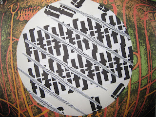
I played around on the computer with the alphabet, with different fonts, with sizes and with combinations of letters. I finally chose F and J to work with.
I thought they had a nice foreign look in some combinations, they joined together in many different ways and the capitals were quite different from the lower case. I also discovered that two capital J's upside down together make a lower case f. Not a world-shattering discovery - I admit.
I wrote the letters with various 'pens' in ink, pencil, graphite and paint. I used bleach in the big F's. I tried writing over sequin waste and cutting out letters from rubbed sequin waste.
The doodling into stylized patterns of FJ was soothing to do and cutting out lots of letters in different styles occupied a happy hour. I had a great time on the computer. The 3D look of massed letters was pleasing and I used these sheets in a few different ways - as backgrounds, folded and as cutouts. I tried lots of my productions in Adobe photoshop, with, I think, some stunning results. This is not a quick process, however, and it whiled away many hours!
I could go on and on but my paper pulp is beckoning.


1 comment:
Crikey,you've hardly paused to draw breath before you're steaming ahead with Mo.4.
I love the way your pockets turned out the colours and stitching are lovely.
Thanks for your comments.
Regards,
Jenn.
Post a Comment